Saturday, June 30, 2012

Toy Review: Dissidia Final Fantasy Play Arts Kai Squall Leonhart


Review:  #98
Name:  Squall Leonhart
Brand:  Play Arts Kai
Line:  Dissidia Final Fantasy
Year of Release:  2011
Volume:  N/A

PACKAGING AND CONTENTS:


Squall comes in a elegant box with a purplish hue and a black lower portion where the logos are.  Fairly bland in terms of personal features, there's no subtle hinting of Squall in the general packaging.


Obviously, the back contains the stock photos of the figure in awesome (and hard to recreate) poses, as well as cross selling the two other figures in the line.


Although the box's proportions are perfect, a lot of the width is wasted, being empty space, they could compact the packaging a lot more actually...


And here's a closer shot of the photos at the back.  These boxes are worthwhile to keep, they feel very premium.


Squall comes with his gunblade and two hands (a left and right) to hold the weapons.  He comes with fists originally attached (which I've swapped out already).

FIGURE:


Let's begin.  This figure of Squall is based on his redesign in Dissidia Final Fantasy, however, and I am kinda glad for this, it's not too far off from his originally appearance in Final Fantasy VIII.  Only major differences are the fur trims on either side of his hips, and the black cloth on his right hip.


Well, there are some colour differences as well I guess.  Anyway, black is the predominant color and it suits the solitary nature of Squall.  You can actually take the bomber jacket off, although I see no reason to (the jacket's made from soft plastic).


You might have already noticed from the above pictures that Squall's posture is just like what he does in the games.  However, there's a trade off... and that is his legs are angled too sharply and sits too far back so that it looks unnatural in a lot of angles.  You can try and straighten it but then he won't be able to stand unsupported properly.


Still, the shape of his legs gives Squall a lot of personality, especially when you're trying to recreate some of his trademark postures from Final Fantasy VIII, such as resting his hand on his hip (I had already swapped the fists out at this point and no way in hell was I going to swap it again just for this pose).


Or you can have him face palm himself.


There was one thing that I always criticized in the earlier Play Arts figures (well, just the Final Fantasy XIII ones) was the head sculpt being ugly and only bearing a passing resemblance to the character.  Well, with Squall, the detailing and expression is spot on.  There's an unbelievable amount of detail in his eyes, and he does have his scar.  You feel as if Squall is annoyed with the whole world.


It doesn't really stop there, his jacket and Griever pendant is present.  I just realised, looking at the photo above, that there are paint scuffing and smearing.  It's not as bad in real life, it just looks really bad here since the camera zoomed in so much.


Squall's gunblade take on the Revolver model, his default weapon in the games and cutscenes.  Probably the model that looks the most 'natural', although the Lionheart model looks pretty wicked as well.  The gunblade is an interesting looking weapon, thought it was lame at first (until I played FFVIII that is, where my opinion changed and I love it now).


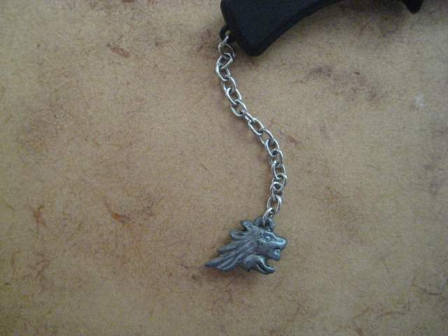
All the details are present.  It even has a Griever pendant attached via a chain (a real chain, not a fake one, so that it swings above whenever you move the weapon).


Can't really tell if the etching on the blade is the Griever (it's supposed to be).  The blade itself can detach, it feels like as if you can get replacement blades for it (or other model types).  What's more, the chamber of the gunblade rotates, that was a really surprising element.


In order to hold the gunblade, you will need to switch out the fists with hands especially sculpted for the task.  Squall only holds the gunblade through friction, and this is very annoying.  It means that the gunblade is never held on too securely, and more often than not, while you're trying to pose him, his grip will come loose and the blade flop around.


Talking about swapping hands, I hate the task.  On my figure (and at least one other I've seen on the internet), pulling out his hands might also pull the wrist joint with it, which is a pain as it's a fragile joint and you can't wiggle it out.


Squall can hold is with two hands.  As you'd expect, the range of motion becomes severely limited.


However, the designer has thought of this, and gave Squall some shoulder flex.  His shoulders fold forward, which makes double hand posing a whole lot easier.  His arms are also well jointed.


The only thing that lets you down is his wrist articulation, which only swivels.  It would have been awesome and way more useful if he got given balljointed wrists, or even just some up-down motion.


I tried to recreate his victory pose of resting his gunblade on top of his shoulder and I can't do it!!!  The elbows are bent as far as they could, and the gunblade as low as possible, but I just can't get it to rest like the packaging or other images I've seen on the internet.  It's very annoying... on mine at least, it seems as if it's the problem of the wrist, maybe it does have an up down joint?


Anyway, the articulation is there for you to do (mostly) whatever you like.  I found that the legs are missing a swivel, but it's no biggies.  Although they have got to redesign those ugly double jointed knees, they look terrible when you use them.


A bit problem with posing Squall is that he may not be easy to stand.  Due to the angle of his legs, and the joints of his feet, it doesn't allow a wide range of poses where Squall will be able to stand flat on his own two feet.  Squall stands at approximately 21cm tall.


At first, the gunblade felt proportionally bigger for him but the more I look at it, the more I think it's perfect.  Also, this Squall is supposed to wield his gunblade single handed, and single handed poses do look better (since they can be more dynamic).


I was worried the waist might have been really thin but it's not the case, and he's got a hidden waist joint and torso joint.  Mine had a slight assembly error though, but it was easy enough to fix (popped out both his legs, and twisted the piece with the hip joints 180 degrees).

OVERALL:

This is an excellent figure, it's looks really good (even if the legs are a bit weird) and evokes the character of Squall very well, whether it's the one from Dissidia or FFVIII.  That said, Squall is my favourite Final Fantasy character so I had to had one of his toy representations...  Anyway, there might not be so much intricate detailing here (given that his design is relatively simple) but there's no reason not to get this figure.

---------------------------

Other toy reviews can be found at this page.

Friday, June 29, 2012

Book Review: D.Gray-Man Vol. 19


Review:  #220
Title:  D.Gray-Man Vol. 19
Series:  D.Gray-Man - 19th volume
Author:  Katsura Hoshino
Read Before:  no
My Comments:  lost its touch.  The first few volumes of the series had chapters that were refreshing, and moving stories, by this volume, it feels like it tries so hard to impress and shock you… that it doesn't quite work.  Same goes with the art, it is become too messy, too many things happening (even when there is no fighting on) and the style feels much darker and cluttered.  Lastly, a truckload of characters are introduced in this volume, too many, in fact, the rest of the Noah appears (bringing it up from five to thirteen), and same goes with characters of the Black Order.  This makes it such that in the last chapters when they appear, you don’t know who the hell they are and what their powers are.  I would have preferred a gradual introduction.  Anyway, a volume that has a quality that’s below par.
Rating:  5.5/10

Wednesday, June 27, 2012

Book Review: A King's Ransom


Review:  #219
Title:  A King's Ransom
Series:  Cahills vs. Vespers - 2nd book
Author:  Jude Watson
Read Before:  no
My Comments:  The story has noticeably taken on a darker tone, and much more interesting.  Throughout the whole book, Amy and Dan are on the defensive side, being blackmailed into doing things, which, personally, I don’t like.  What the siblings did in this book was incredible, so incredible in fact, that it lines on the border of being impossible and exaggeration.  If you think about it, even though they have a lot of resources, they’ve managed to find some artefacts that no one have found for centuries, and I’m pretty sure they aren’t the only people with resources that have tried to find it (apparently the Vespers are a huge threat, yet even they couldn't find it?!?).  There are some noteworthy plot twists, particularly the ones involving the father of the siblings.  The ending improved the story a lot, and made powering through some of the more bland parts worth it.  The death at the end was sad as well, particularly since it was a good character.
Rating:  6/10

Monday, June 25, 2012

Book Review: D.Gray-Man Vol. 17


Review:  #218
Title:  D.Gray-Man Vol. 17
Series:  D.Gray-Man - 17th volume
Author:  Katsura Hoshino
Read Before:  no
My Comments:  The first few chapters of this volume, when it dealt with the spreading virus, were very funny.  There were so many gags and jokes, that there were pretty much one every page you turn.  However, this just hid the fact that the story wasn't that good.  The reason behind the virus was pretty stupid, and the whole idea, of a spreading virus turning people into zombie-ish monsters isn’t new or original, and it’s been done a lot in other manga series.  It was finished in the worst possible way, one page, a few sentences, explaining that it was just solved by someone (Bak) who came after everyone was infected, it feels very lazy.  The rest of the volume takes on a more serious not, but I find it not as interesting on how the story is developing.  The author has succeeded in making Rouvelier an extremely annoying character.  What happened to Cross was very mysterious and I look forward to finding that out in the later volumes (if it is going to be revealed…).  Anyway, I felt this was a mediocre volume, it just didn't feel quite right.
Rating:  6/10

Sunday, June 24, 2012

Toy Review: Transformers Prime First Edition Vehicon


Review:  #97
Name:  Vehicon
Brand:  Transformers
Allegiance:  Decepticon
Line:  Prime - First Edition
Year of Release:  2011
Size Class:  Deluxe (First Edition Wave 2)
Variations:  none as of yet

VEHICLE MODE:


Vehicon transforms into a low riding sports car, the deep purple used suits this Decepticon drone.  He features clear plastic for his windows, so you can see all the joints inside, which wrecks the streamlined look.


There's a lighter purple highlighting various areas of the car, most notably the rear.  I feel it gives a bit of Tron feel to it.


As mentioned, he's a low riding car, to the point where it's not very easy to roll him freely.  The fact is that there's very low clearance, and you have to transform and fit everything correctly before you can even attempt to roll him on a flat surface (that said, I don't think he can roll well on carpet).


It's been mentioned by a lot of people that it looks like the Batmobile, and I think it's because of the colour and the shape of the spoiler (which looks really nice by the way).  There's a Decepticon symbol on the hood like a hood ornament.


Due to the way the shoulders are in robot mode, the sides of the back of the car are hollow, so when you view the rear at an angle, you can see the gap.  A minor nitpick.  There are not too many panel breaks, considering that there are a lot of pieces that moves for the transformation.


It is a very packed vehicle , and you can store the gun underneath (more securely than First Edition Bumblebee for sure).  All pieces clip together, and the car holds together very well.


Being a First Edition toy, it's bigger than the Robots in Disguise line of Deluxes.  However, Vehicon still feels somewhat smaller than Deluxes of the past.


If you would like the vehicle to have some attacking power, you can peg the gun onto one of the holes on the bonnet.  It's looks decent enough, well, at least it's not ridiculous.


A very sleek car, and one that looks great on display.  It's very show accurate too.

TRANSFORMATION:

If it wasn't for how the legs form, I would say the transformation was fairly unremarkable.  That said, the legs unfold from the hood in a fairly interesting way.  That said, there are a lot of panels that end up at the back of his legs and it gives the legs a somewhat odd looking shape from the side.  Anyway, I don't like how the arms are on two long thin pieces of plastic, and that's it.  It doesn't lock into the torso, and it feels like they're  susceptible to snapping off.  The transformation is a fun process and one that doesn't put you off from future conversions.

ROBOT MODE:


The robot mode looks great, and feels very solid.  I love the look of his shoulders, and you can either leave the wheels on his shoulders or fold them down to behind the elbows.  Not too sure why they added this joint as the show has them on his shoulders.


However, this figure is very kibbly.  From the legs to his back.  He has the top of the car folded into three panels onto his back.  I wished it could have been compressed more, since the rear of the car knocks and rests behind his head.


The head sculpt looks nice, and it's painted completely in silver.  Vehicle has clear lightpiping but the visor is painted red.  The head is on a restricted ball joint, so it's range of motion isn't as great as you would have expected.


The dark and brooding colour scheme continues on here, but with the addition of dark purple paint.  Vehicon looks like he has a waist joint, but he doesn't.


Vehicon has a bulky robot mode due to all the panels and kibble, but it's infinitely better than being skinny and lacking mass.


His torso has some very very nice sculpted elements.  He has a Decepticon insignia on his chest, I would have preferred the bit underneath the clear plastic to be painted silver to contrast the figure more, as Vehicon has a dark enough colour scheme already.


Vehicon looks very cluttered from the side.


Let's focus on the weapon now shall we.  He has the gun that he uses in the show.  It contains a peg that you can use to peg into his hands/forearms.


There's two ways that you can attach the gun, and both require you to unfold the forearm (which kinda sucks).  The first way is that you can plug it underneath the hand and it looks decent enough there.


However, the better way is to fold his hand back completely, which reveals a peg hole, so it looks like his hand has morphed into a gun.


The articulation is great, and even with all the kibble, the range of motion isn't too bad.  The biggest thing you'd miss is the lack of an elbow swivel.  He has a ball joint that's attached to the side of the arm instead, but it does not provide the same range of motion.


The shoulders also get into the way of the back kibble.  His feet (although they look more like toes) is jointed on a hinge, so he can stand flat in a variety of poses.


The shoulder joints are stiff and since they're not locked into the torso, the pieces of plastic they're on bend and warp a bit as you try to move them.


A good robot mode, not as show accurate as the other First Edition toys (I think the Robot in Disguise version is better in that aspect.

OVERALL:

Just on the figure itself, it is a decent toy.  Very often, an army-builder gets a lot of attention and sales even though the toy is bad... thankfully that's not the case here, although this particular version of Vehicon will be a very expensive toys to buy multiples over.  Vehicon could have done with more lighter colours as highlights.  Recommended.

-----------------------------

Other Transformers reviews can be found here.
Blogger Widget